
Luxury has always been a sensitive barometer of the world’s emotional temperature. Long before economic data or trend reports catch up, colour tells the story. In the last four years, Pantone’s selections have traced a quiet but telling arc—from assertion to softness, from grounding to near-erasure. Now, with 2026’s Cloud Dancer, luxury finds itself at an inflection point.
In 2023, Viva Magenta arrived with unmistakable force. A chromatic statement rather than a suggestion, it reflected a post-crisis appetite for presence. Global luxury houses embraced it selectively—often as accent rather than excess—signalling confidence, vitality, and creative defiance. It was the colour of survival refined into style.
By 2024, the emotional register softened. Peach Fuzz introduced intimacy into the luxury lexicon. It was not about spectacle, but about tactility—skin-adjacent tones, quiet sensuality, emotional warmth. Fashion leaned into brushed textures and softened silhouettes; beauty embraced flushed neutrals; interiors favoured enveloping light. Luxury recalibrated from dominance to discretion.
Then came 2025’s Mocha Mousse, a shade that felt almost inevitable. Earthy, indulgent, reassuring, it anchored a global desire for stability. From Milanese leather goods to Parisian cafés, from hotel lobbies to beauty packaging, Mocha Mousse worked because it conveyed trust. It was richness without excess, depth without noise. Luxury slowed down—and found confidence in weight, texture, and permanence.
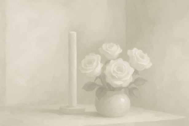
Against this lineage, Cloud Dancer feels less like evolution and more like rupture. A near-white so pale it resists identity, Cloud Dancer signals a profound psychological shift in global luxury: from reassurance to retreat. It embodies restraint taken to its extreme—clean, controlled, emotionally distant. In private luxury spaces, this has its place. Wellness resorts, personal sanctuaries, meditative environments all benefit from visual quiet. But when this palette migrates wholesale into luxury retail, fashion presentation, and brand environments, the effect is destabilising.
Luxury does not operate on neutrality alone. It thrives on tension—between light and shadow, restraint and indulgence, minimalism and meaning. When store windows in Paris, New York, Tokyo or Shanghai are washed entirely in Cloud Dancer, they risk becoming invisible. Objects lose gravity. Materials flatten. Desire dissipates. T
his is not a failure of minimalism, but a misunderstanding of it. The most enduring luxury minimalism—Japanese, Scandinavian, modernist European—has always relied on warmth and material intelligence. Stone with grain. Wood with memory. Fabric with weight. Cloud Dancer, when left unanchored, offers light without soul. What this colour reveals is not that luxury consumers want less emotion—but that they are fatigued by emotional excess.
Cloud Dancer reflects a global craving for pause, for neutrality as relief. Yet luxury’s role has never been to erase feeling; it has been to curate it. The houses that will lead in 2026 will treat Cloud Dancer not as a dominant statement, but as a negative space—a canvas against which richer tones and textures can assert themselves.
Think: pale backdrops paired with deep espresso leathers, brushed gold hardware, smoked glass, warm skin tones, mineral greys, ink blacks. Calm, yes—but with character. In this sense, Cloud Dancer is a diagnostic colour. It tells us where the world is emotionally exhausted. But luxury, at its best, does not mirror exhaustion. It offers elevation. The future of global luxury will not be loud. But neither will it be blank. It will be quiet, layered, sensorial—and unmistakably alive.